Zii...Incredible entries...thank you:)(I will have more detailed feedback later)....


Ready for your call :)
Mon — Fri, 2am — 8pm (EST)
US & EU support teams
We are back in: 1h 20m
Mon — Fri, 2am — 8pm (EST)
US & EU support teams
Elite Designer

Posted 30 January 2007 - 09:22 PM
Apprentice Designer

Posted 31 January 2007 - 07:12 AM


Elite Designer
Posted 31 January 2007 - 01:49 PM
Apprentice Designer

Posted 01 February 2007 - 02:14 AM
Apprentice Designer

Posted 01 February 2007 - 04:10 AM
Apprentice Designer
Posted 01 February 2007 - 03:22 PM
I love the photo, though it is a pity you haven't worked much on the background
Elite Designer
Posted 02 February 2007 - 01:37 PM
Elite Designer
Posted 04 February 2007 - 12:32 AM

Apprentice Designer
Posted 04 February 2007 - 02:33 AM
Apprentice Designer
Posted 04 February 2007 - 07:35 AM
Apprentice Designer
Posted 04 February 2007 - 08:35 AM
first of all, congratulations to nicholas for winning the contest. enjoy your price and the step you achieved that puts you more close to be part of the design team!
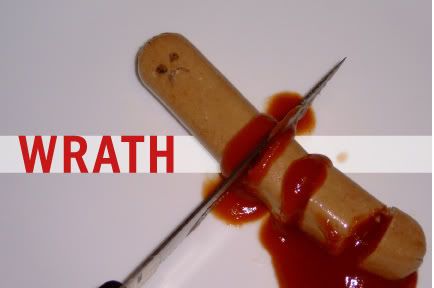
but i really don´t think that he should be the winner. i can´t understand why you thought that his entry was better than zii´s. indeed, lemieuxster was from my point of view much better. in fact lemieuxter´s has a solid idea behind, the concept is clean and clear; maybe his graphic resolution wasn´t the best, but his idea was great. zii´s concept was brilliant and his pieces communicated in a great way the feelings of the sins.
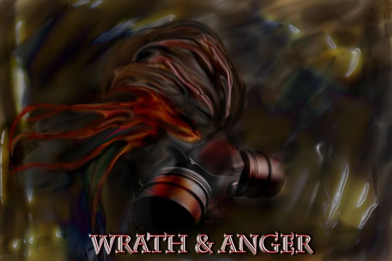
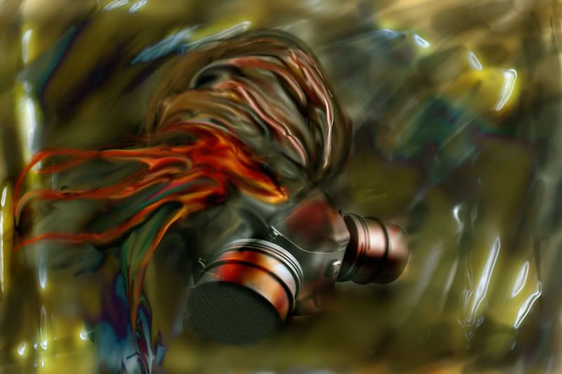
can you tell me why nicholas won? at his piece i don´t see anger, wrath or anything. the only concept that communicates that piece to my is WAR or NUCLEAR WAR. that´s not a deadly sin. it´s graphically poor, just a bunch of photoshop filters with no other intention that make a crazy background.
please, explain me because i don´t understand. i´m really surprised... i´m really are. in fact, reading the feedback you made to zii, was very clear that he would be the winner. and i was 100% agree with that resolution, because his concept and graphic were superb. abstract and right to the heart.
i hope this post doesn´t hurt nichola´s feelings. i´m sure he can make a whole lot of things much better than this.
sorry, but i´m really confused about this.
Apprentice Designer

Posted 04 February 2007 - 09:28 AM


0 members, 1 guests, 0 anonymous users